

 Could Establish a Vital ‘Higher Low’ Pattern")
Ethereum has consistently stood out, not just as a platform, but also as an asset exhibiting significant price dynamics. Upon analyzing the daily Ethereum/USDT chart on Kraken, an encouraging pattern seems to be developing, offering hope to ETH enthusiasts: the potential emergence of a “higher low” pattern.
For those who may be unfamiliar with the concept, the “higher low” pattern is a technical indicator often associated with a bullish reversal in an asset’s price trend. It materializes when the asset’s price forms a low point that surpasses the previous notable low, which is precisely what appears to be unfolding in Ethereum’s case. Should this pattern continue to take shape, it could serve as a strong indicator of Ethereum’s underlying price strength and its ability to withstand broader market downturns.
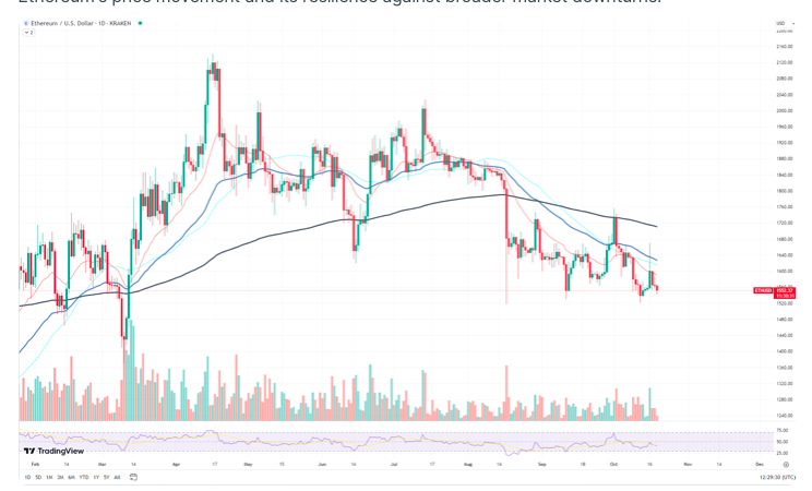
Adding to this positive analysis is the surge in trading volume that accompanies Ethereum’s recent price movements. Typically, an uptick in trading volume is viewed as a confirmation of the prevailing price trend. When coupled with potential bullish patterns like the “higher low,” an increase in trading volume can signify robust buying interest and a decrease in selling pressure.
While it’s essential to maintain a healthy dose of skepticism when making market predictions, the current situation presents an intriguing scenario for Ethereum. The potential emergence of the “higher low” pattern, combined with the strengthening trading volume, creates a compelling argument for a potential reversal in price. Both investors and traders may find it prudent to closely monitor Ethereum’s forthcoming actions.
The support level for XRP remains intact and has not been breached.
The XRP market, akin to many others in the cryptocurrency space, experiences phases of volatility and consolidation. Having a firm grasp of its technical outlook is indispensable for astute investors. A pivotal observation from the XRP/USDT daily chart on Binance is the resilience of the fundamental support level, approximately at the $0.47 threshold. Despite recent fluctuations in the currency’s value, this level has demonstrated remarkable stability, suggesting its potential importance as a rebound point.
Let’s address a prominent concern— the “death cross.” This technical chart pattern, typically indicating the possibility of a significant market downturn, is usually recognized when the short-term moving average crosses below its longer-term counterpart. However, in the case of XRP, its relevance is subject to debate. The current trajectory of the asset and prevailing market conditions do not necessarily align with the historically bearish implications of this pattern. It’s crucial to take a holistic view and not become fixated on individual chart patterns, especially when they contradict other indicators.
Speaking of indicators, it’s worth highlighting the declining trading volume accompanying XRP’s price movements. Traditionally, a decrease in volume during a downtrend can imply a waning of selling pressure. When combined with the unwavering support level at $0.47, this presents an intriguing scenario. The subdued trading volume might suggest a potential depletion of bearish momentum, indicating the possibility of a trend reversal or, at the very least, a consolidation phase.
Cardano is preparing for action.
Cardano (ADA), a prominent player in the cryptocurrency arena, seems to be establishing a robust foundation for a potential reversal in its daily chart against Tether (USDT) on Binance. The chart unveils an intriguing scenario for ADA, hinting at a strategic move in the making.
First and foremost, there’s a discernible support level to which ADA appears to be firmly anchored. This support level isn’t arbitrary; it carries historical significance. It was at this same price point in December that Cardano displayed resilience and executed an impressive comeback. This price level has proven itself as a solid cornerstone, and ADA’s current adherence to it suggests the possibility of a historical repetition.
Furthermore, in addition to the evident support, another compelling aspect on the chart is the squeeze occurring between this support level and the 50-day Exponential Moving Average (EMA). The 50 EMA is frequently employed by traders and analysts as a medium-term price trend indicator. A squeeze of this nature usually signifies a showdown between bullish and bearish forces, ultimately leading to a breakout in one direction.